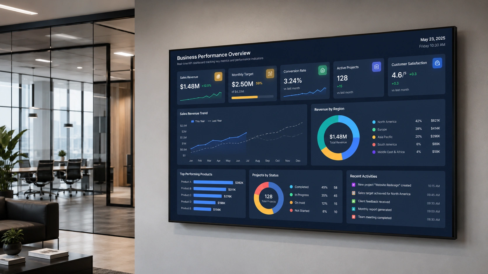
Display real-time KPI data from Power BI, Tableau, and Salesforce on any workplace screen. See which metrics to show, which to keep private, and how to set it up.
Explore Pickcel Digital Signage →
- Fewer than half of employees know what is expected of them.
- Any screen can display live Power BI, Tableau, or Salesforce data.
- Team-level metrics motivate; individual performance data stays off shared screens.
Your team’s KPI data is probably accurate. The problem is that only two or three people ever see it.
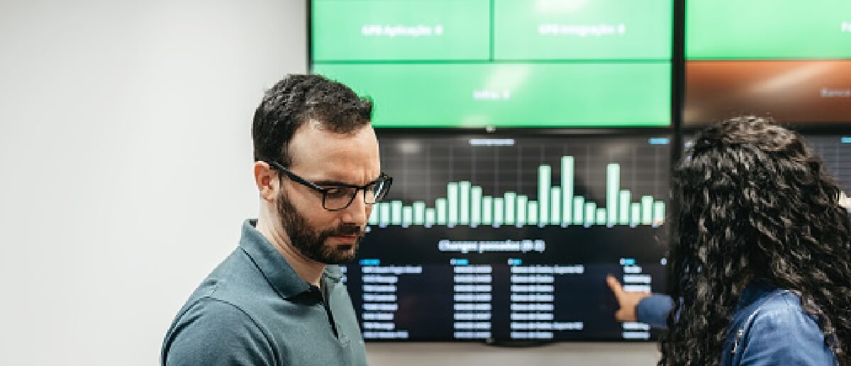
Sales dashboards live on a director’s laptop. Manufacturing output rates sit in an ERP system the floor team cannot access. Customer support ticket volumes update in a BI tool that agents never open during a shift.
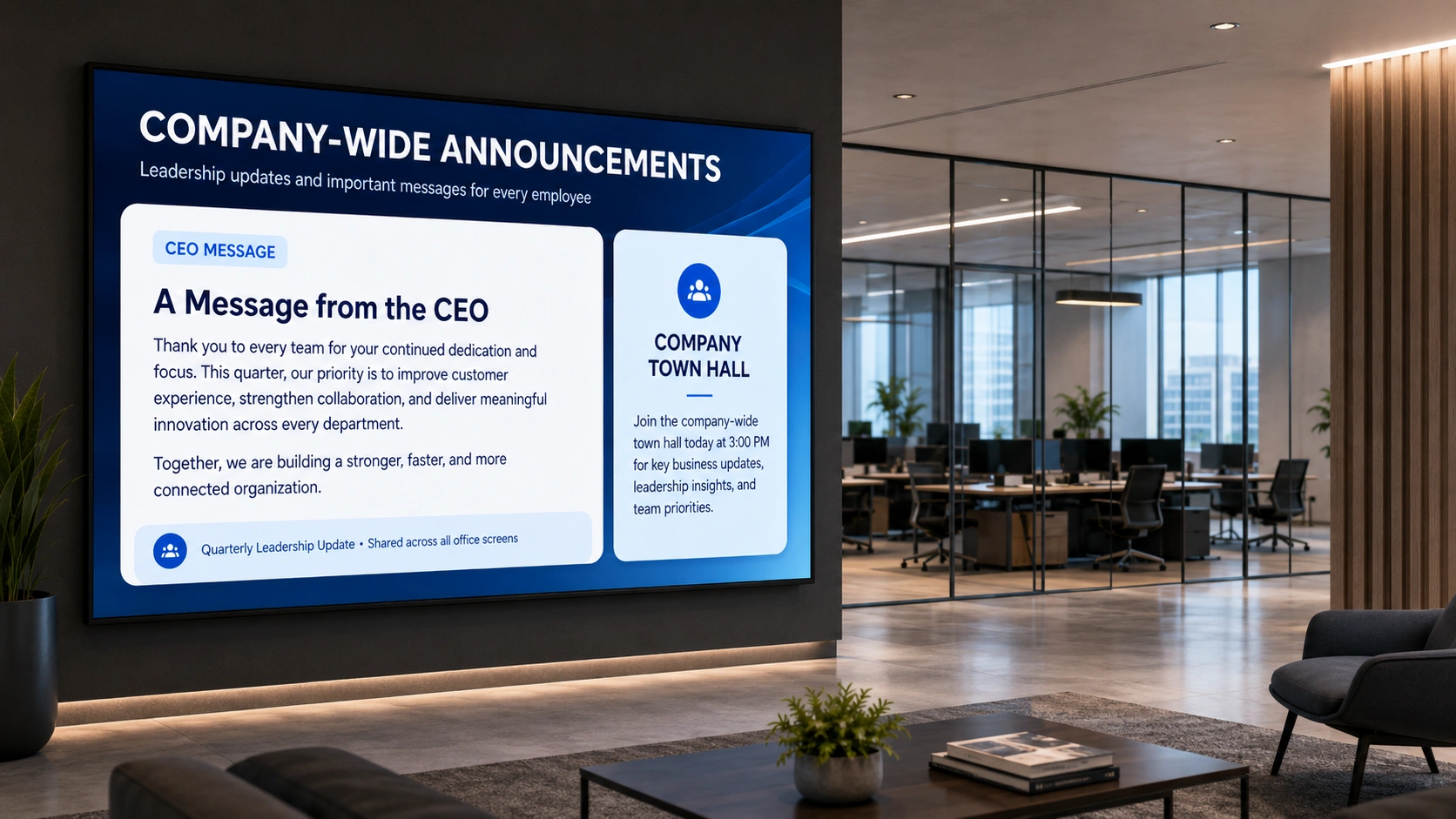
When performance data is invisible to the people doing the work, it loses most of its motivational and accountability value. KPI dashboard screens change that. They pull live data from Power BI, Tableau, Salesforce, or any connected system onto any workplace screen, in real time, visible to the whole team.
This guide covers what to display, which metrics to keep off shared screens, and how to connect your existing data to workplace screens using Pickcel digital signage software .
What Is a KPI Dashboard Screen in a Workplace?
A KPI dashboard screen in the workplace is a display showing real-time key performance indicators pulled from your business systems, such as your sales CRM, BI platform, or operations software, and made visible to everyone in a shared workspace. Unlike a BI dashboard open on a single manager’s laptop, a KPI screen is ambient: it keeps the whole team aware of how they are performing against targets without anyone having to open a tool or request a report.
The screen connects to your existing data source and refreshes automatically. No printed reports, no email summaries, no manual updates. The data you are already tracking becomes part of the shared environment your team works in.
Organisations use KPI screens in corporate offices, factory floors, call centres, retail back offices, and logistics hubs. The delivery mechanism is the same in each case: live data from existing systems, displayed on a screen that anyone in the room can see.
Why Visible KPI Data Improves Team Performance
Fewer than half of employees, 46%, clearly know what is expected of them at work, according to Gallup’s January 2025 research on U.S. employee engagement , down from 56% immediately before the pandemic. That clarity gap is not just a communication problem. When people cannot see how the team is tracking against its targets, they cannot calibrate their effort during the day. Visibility closes part of that gap.
There are three practical effects on team behaviour:
Accountability without micromanagement. When everyone on the team sees the same number, individuals are more likely to raise a concern or change their approach without being told to. A shared KPI screen creates collective awareness; managers do not need to relay the same data point in separate one-to-one conversations.
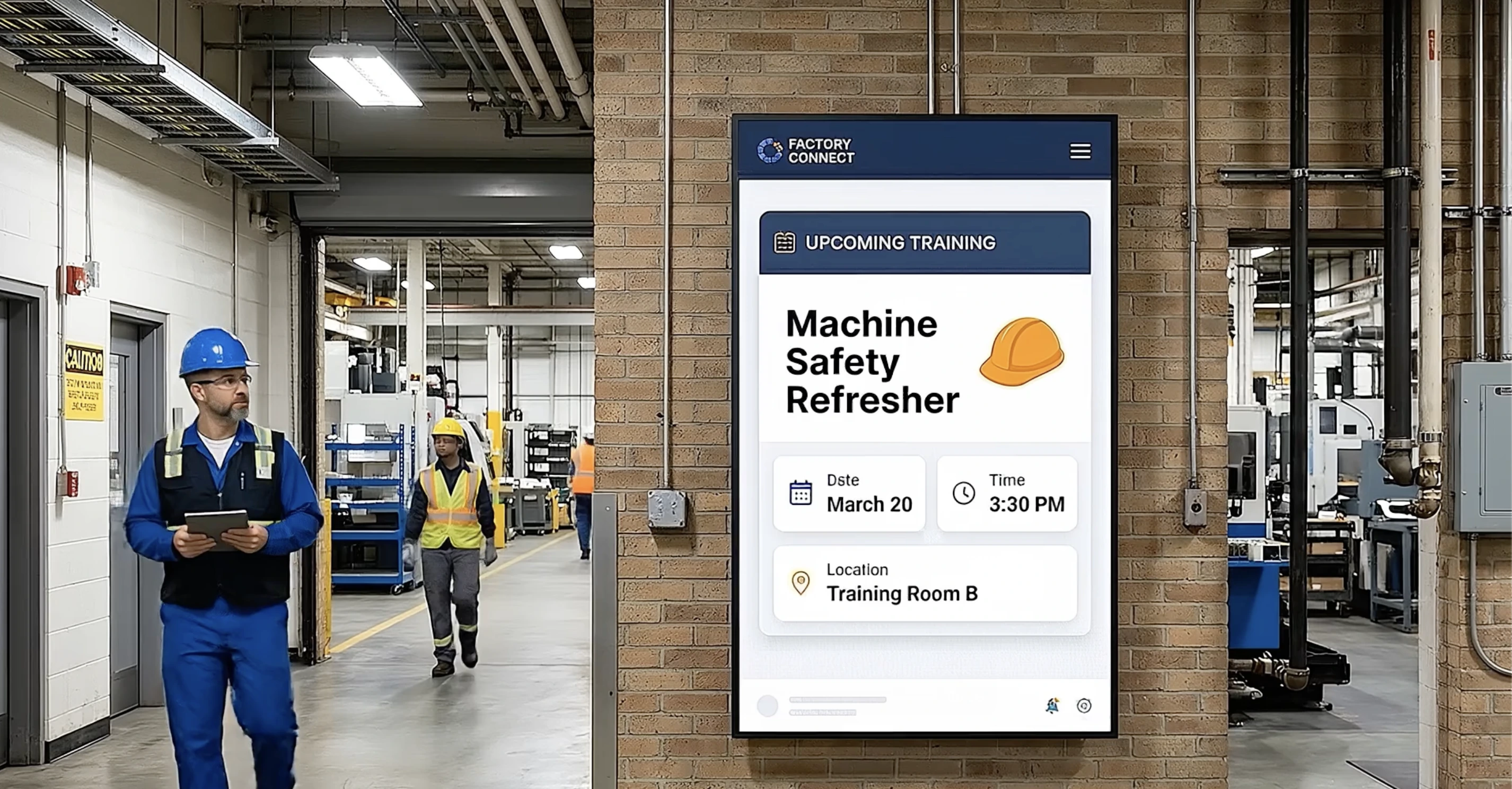
Faster response to drops. On a manufacturing floor, a visible OEE drop triggers intervention faster than a figure buried in an ERP system that only the shift manager checks at the end of the day. In a call centre, a rising average handle time on screen prompts supervisors to act while there is still time to shift the result, not after the report is generated.
Goal alignment across a shift or quarter. When the team’s collective target is visible in the shared workspace, individual tasks connect to something larger than a to-do list. Goal visibility is consistently associated with higher sustained effort and faster self-correction; the research basis for this runs from Locke and Latham’s goal-setting theory through decades of workplace performance studies.
The key word is “shared.” A KPI dashboard on a manager’s screen produces information for one person. A KPI screen on the office or factory floor produces a shared context for the whole team.
What KPIs Should Be Displayed on Workplace Screens?
The right KPIs depend on the function and audience. The wrong ones can create friction, privacy concerns, or competitive dynamics that work against team cohesion.
Sales and Revenue Teams
- Pipeline value: current vs. monthly or quarterly target
- Revenue closed this month and this quarter
- Number of deals in each stage of the funnel
- Calls made or meetings booked today
- Win rate over the trailing 30 days
Start with team-level aggregates. A leaderboard showing individual rep rankings can motivate some teams and produce exactly the wrong behaviour in others. Know your team before publishing individual performance data on a screen visible to the whole floor.
Manufacturing and Operations
- OEE (Overall Equipment Effectiveness): current vs. shift target
- Production rate: units produced this hour vs. target rate
- Shift total: units completed vs. daily target
- Defect or reject rate
- Machine downtime this shift
Manufacturing KPI screens are naturally team-level because the output is a collective product. They work well on factory floor displays without creating individual privacy concerns.
Customer Support and Service
- Open ticket count
- Average response time vs. SLA
- First-contact resolution rate
- CSAT or NPS score: this week vs. last week
- Tickets resolved today vs. daily target
Avoid displaying individual agent handle times on a shared screen unless your team has explicitly opted into that context. Team-level resolution rates achieve the same alignment effect without the pressure of visible individual rankings.
Logistics and Fulfilment
- Orders picked today vs. today’s target
- Dispatch accuracy rate
- On-time delivery rate for today’s outbound
- SLA compliance: percentage of orders within window
What to Keep Off Shared Screens
Individual performance data where ranking creates unhealthy competition, HR metrics linked to identifiable individuals, payroll-adjacent figures, and anything subject to GDPR data minimisation obligations should stay off shared screens.
The general rule: display metrics that tell the team how the team is doing. Keep metrics that evaluate individuals for manager dashboards and one-to-one reviews, not for the break room wall.
How to Display KPI Dashboards on Workplace Screens with Pickcel
Pickcel connects to Power BI, Tableau, and Salesforce directly. For any other BI tool that generates a shareable URL, the setup works through an embedded URL method. You do not need to rebuild the dashboard or expose internal credentials.
The setup follows three steps.
Step 1: Connect your data source
Open the Pickcel CMS and go to the app library. Select the integration for your BI tool:
- Power BI: Paste your report’s publish-to-web URL, or use Pickcel’s Power BI integration for authenticated display of reports that are not publicly published. Pickcel handles the token refresh.
- Tableau: Use the Tableau Dashboard App extension to generate an embed URL, then paste it into Pickcel. The connection honours your existing Tableau authentication settings.
- Salesforce: Connect via Pickcel’s Salesforce integration . You can display leaderboards, pipeline summaries, or any dashboard object your Salesforce credentials can access. Pickcel acknowledges object-level permissions so only authorised data reaches the screen.
- Other tools (Looker Studio, Geckoboard, Domo, custom web dashboards): Paste the embed or shareable URL directly into a web-app content block. Any dashboard that generates a URL works.
Step 2: Assign to your screens
Once the app is configured, assign it to one or more screens from the Pickcel console. You can target by location, department, screen group, or floor. A sales floor in one office and a sales floor in another city can display the same live pipeline dashboard, or separate regional targets, from the same console.
Step 3: Set the refresh interval
Choose how frequently Pickcel pulls updated data. Real-time sources like Power BI and Salesforce can update as often as the BI tool publishes. For most workplace KPI screens, a 5- to 15-minute refresh interval keeps data current without creating visual distraction from constant changes.
All of this is managed through the same digital signage software console you use for every other screen in the business.
On security and compliance
If your organisation requires an on-premise deployment, Pickcel supports it: all data and screen communication stay inside your corporate network, with no reliance on external cloud services. Pickcel is SOC 2 Type II certified and ISO 27001 certified, which matters for organisations whose IT security team reviews third-party software that touches business data. Pickcel is used by more than 9,000 businesses across 70 countries, managing over 150,000 screens, from single-site corporate offices to multi-plant manufacturing networks.
If you are displaying Salesforce or HR-adjacent data, role-based access control in Pickcel lets you restrict which users can create, edit, or assign content for specific screen groups.
Start displaying your KPI data on any screen
The Pickcel digital signage dashboard page has a full overview of dashboard capabilities and live data connections
Frequently Asked Questions
What is a KPI dashboard screen in a workplace?
How does Pickcel display real-time KPI data on office or factory floor screens?
What BI tools can Pickcel integrate with to display live KPI dashboards?
What KPIs should be on workplace screens and which should stay private?
How does making KPI data visible on shared screens affect team performance?
Is it safe to display Salesforce or Power BI data on workplace screens with Pickcel?
Start displaying your KPI data on any screen
The Pickcel digital signage software page has a full platform overview and a dashboard demo that walks through the live data connection.