
Dec 24 2025
10 min read
December 09, 2025
14 min read


ALL
GENERAL

Is this content helping the business hit its goals, or just filling a screen?
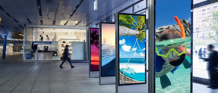
Every team managing digital signage eventually comes back to one question. Whether you’re running retail promos, QSR menus, branch messaging, patient guidance, or internal comms.
And the only reliable way to answer it is to run A/B tests on your digital signage content.
A/B testing gives you clarity that dashboards alone can’t.
| Operational dashboards help you see | A/B testing helps you understand |
|---|---|
| The screen is online, and the content is playing as scheduled. | Which version changed behaviour or outcomes. |
| How many people passed by or saw the screen. | Which layout lifted the add-on or impulse purchases. |
| Loop performance and exposure timing. | Which message eased queue pressure or reduced friction. |
| That safety or compliance content reached the screen. | Whether the reminder was actually noticed and acted on. |
In physical environments where audience flow, dwell time, and location bias shift constantly, tests become even more important because the same content behaves differently across stores, dayparts, or zones.
This is also where digital signage diverges from web/app testing.
A reliable digital signage software solution becomes the backbone here, helping ensure your scheduling and playback stay clean enough for a valid test.
You’re not optimizing clicks; you’re working with dwell, visibility, POS correlation, QR scans, and downstream actions.
Flagship-level footfall at 6 PM isn’t the same audience or volume as a quiet branch at 11 AM. That’s why physical testing needs structure.
Spatial testing: Compare versions across comparable locations or screen groups.
Temporal testing: Rotate versions on the same screen across different time windows.
Hybrid testing: Use both when you need to remove location and timing bias for higher accuracy.
A common misconception is treating content “refreshing” as testing. Swapping creatives to keep screens fresh is routine hygiene.
Testing is different; you isolate one variable, attach it to one metric, and observe the impact. That one-change rule is what keeps results trustworthy. Multivariate tests only make sense in very high-traffic environments; everywhere else, they dilute limited impressions and delay decisions.
Most teams already have the questions that hint at a test: QR scans are low, loops feel slow, layouts feel heavy. The work is turning those questions into hypotheses you can measure and act on.
What this looks like in practice:
Turn the question into a simple hypothesis: change X → expect Y → because Z.
Pick the single variable that actually matters (copy, hierarchy, timing, or format).
Choose where the test runs: one screen, screen groups, or comparable locations.
Check the baseline traffic to confirm you can detect the lift you’re aiming for.
If the expected effect is too small for the available window, adjust the scope before you start.
Testing also gives structure to the decisions that sit under your content governance workflows, helping teams move from “approved content” to “proven content” before choosing the KPI that matters.
Who This Is For:
Marketing, CX, and digital teams who run screens across retail, QSR, banking, healthcare, or workplaces and need a clear way to prove what content actually drives sales, scans, or engagement.
Digital signage A/B testing only works when the outcome is clear. Physical screens play different roles depending on where they sit, so each test needs a KPI that aligns with the screen’s role.
| Location / Screen Role | Primary KPI | What to Test Here |
|---|---|---|
| Storefront / Window | Footfall capture / gaze-through rate. | Best for testing motion vs static, offers vs brand cues. |
| Aisle / Product Zones | Dwell time/interaction rate. | Use when screens support product discovery. |
| Checkout / Counter | Sales lift/attach rate. | Ideal for upsells, queue messaging, and pacing tests. |
| Reception / Lobby | Recall / fewer wayfinding questions. | Useful for visitor guidance and brand clarity. |
| Waiting Areas | Perceived wait-time scores / QR scans. | Works well for informational and utility content. |
| Office Corridors / Internal Comms | Engagement/compliance improvement. | Good for safety, culture, and KPI updates. |
With the KPI locked in, the real work is designing a test that the physical world won’t distort, choosing the setup, isolating the variable that matters, and making sure your stack can deliver a clean comparison across uneven locations and shifting dayparts.
| Test aspect | What it means in practice | When to use |
|---|---|---|
| Spatial splits | Run A in one group of comparable locations and B in another; compare vs each store’s baseline, not raw volumes. | Testing themes, formats, or hardware where site-level differences matter. |
| Temporal splits | Run A and B on the same screen in alternating / randomized windows (by loop, hour, or shift). | Optimising content on existing screens without changing placement or hardware. |
| Hybrid setups | Use matched store groups and rotate A/B within each group to balance both location and time. | Higher-stakes tests where you need stronger confidence in the winner. |
| Test duration | High-traffic: 1–2 weeks. Low-traffic: 3–4+ weeks, with bigger creative changes rather than micro-variants. | Planning realistic timelines and avoiding underpowered tests in low-traffic sites. |
| Variable Type | What You Can Change | What It Usually Impacts |
|---|---|---|
| Message | • Offer vs value • Urgency vs reassurance • Benefit vs feature • Tone/clarity | • Sales lift • Attach rate • App adoption • Compliance/safety uptake |
| Visual hierarchy | • Full-screen vs split • Product-first vs price-first • Dense vs simplified layout | • Dwell time • Recall • Clarity of choice at the shelf/menu |
| Format | • Static vs motion • Animation pacing • Simple vs complex • Passive vs interactive | • Engagement rate • Interactions • Attention on hero items |
| Timing | • Dayparting • Loop length • Position of promo within playlist | • Hourly sales patterns • Perceived wait time • Promo utilisation |
| Placement | • Entrance vs aisle vs checkout vs waiting zones • Eye-level vs overhead | • Footfall capture • Impulse buys • Queue experience • Message visibility |
Start by confirming your CMS can control distribution and your data can verify playback. Without that, no test will give a trustworthy result.
| Requirement | Why It Matters |
|---|---|
| Player groups/tags | Needed for spatial splits and isolating comparable locations. |
| Granular scheduling & dayparting | Supports temporal splits without time-of-day bias. |
| Proof-of-play logs | Ensures the KPI window matches the content exposure. |
| Content versioning | Prevents overrides and makes comparisons clean. |
| POS/transaction data | Best for outcome-based tests where sales lift is the KPI. |
| QR scans / unique URLs / coupon codes | Gives a clean attribution link from the screen to the action |
| Short surveys/feedback signals | Useful when the KPI is behavioural or experiential, not transactional. |
| (Optional) audience analytics/sensors/touchs | Sharpens insights, but isn’t required for a first test. |
These controls need to hold across every digital signage player you run, whether the network is cloud-managed or uses an on-premise digital signage software setup.
Pick the exact screens or screen groups that will be in the test.
Pull recent data (e.g., last 4–6 weeks) for the KPI you’ve chosen: sales, scans, dwell, recall, etc.
Note typical patterns by day and daypart to avoid mistaking normal swings for test impact.
Lock this in as the “before” state you’ll compare against.
Turn the idea into a simple line: “On these screens, changing X should improve Y by Z% over N weeks.”
Make sure X is one variable (message, layout, format, timing, or placement).
Double-check that Y is the KPI you already mapped to that screen’s role.
Confirm that the expected lift is realistic for the traffic those screens see.
Treat the current live content as Control (A) unless there’s a better reference state.
Create Variation (B) with only the chosen variable changed. Everything else stays constant.
Keep both versions within your existing content governance rules (brand, legal, ops).
If attribution matters, give B its own QR, URL, or code so it can be separated cleanly in the data.
Apply the test structure you chose earlier:
Temporal: set up an A/B rotation on the same screen by loop, hour, or shift.
Spatial: assign A and B to matched screen groups using player tags.
Hybrid: do both across matched locations and time windows.
Aim for a simple, even split (e.g., 50/50 exposure).
Use proof-of-play reports to confirm A and B are actually being served as planned.
Solid digital signage security also matters here; stable access control and protected endpoints keep the test environment predictable instead of introducing hidden variables.
Run the test for the duration you decided: usually 1–2 weeks for high-traffic, 3–4+ for low-traffic.
Avoid touching the playlist, loop order, or placement mid-test unless something is broken.
Watch for outages, black screens, or player issues and note any incidents against the timeline.
Make a note of any external events (holiday, extreme weather, big promo) that could explain spikes.
If uptime issues often interfere with testing, you may find this practical guide useful:
→ 20 Tweaks to Boost On-Premise Digital Signage Uptime Today.
Pull the KPI data for the test window and segment it by A and B.
Compare the rates, not just raw volumes (e.g., attach rate, scans per 1,000 visitors, etc.).
Check whether the difference is large enough to matter for the business.
Look at a simple cut by daypart or store type to see where the effect is strong or weak.
If B clearly beats A on the agreed KPI, promote it as the new default for that screen role.
If the pattern isn’t strong enough to trust, record it as inconclusive and escalate to a more substantial variation.
Scale the winner in a controlled sequence: pilot, wider rollout, then full estate once the performance holds.
Over time, this log becomes the internal playbook that keeps you from re-testing the same ideas and helps new campaigns start from “what’s already proven,” not from scratch.

Pickcel already gives you the control layer you need to run clean tests on real networks.
Screen cohorts via player groups and tags: Use player groups and tags to split comparable locations or zones into A and B, so spatial tests stay tidy even at scale.
Playlist-to-screen mapping with tag filters: Tie each version to its own playlist or campaign, then use tag-based targeting so the right creative reaches the right screens without manual juggling.
Daypart and rotation scheduling for temporal/hybrid tests: Dayparting and granular scheduling let you alternate A/B on the same screen or mix spatial + temporal setups when accuracy matters more.
Proof-of-play logs and reports instead of guesses: Proof-of-play logs and reports give you a clean record of when each version ran, so you can join it with POS, QR, or survey data and call a winner with confidence.
A retailer needed to lift sales of one specific shoe on a product wall. They tested two cards on the same screen:
Version A: price-first (“20% off this week”).
Version B: same image and price, but headline replaced with stars + a one-line review.
They alternated A/B in short time blocks on that screen and tracked SKU-level sales and QR scans. Version B outperformed A, showing that for this SKU, social proof worked better than a pure discount message.
A QSR chain wanted to increase add-on items without redesigning the whole menu. They tested two versions of the same digital board:
Version A: standard static menu layout.
Version B: same layout and pricing, but with subtle motion only on the fries/drink/add-on panel.
They ran A in one set of comparable stores and B in another, then compared the attach rate for those items. Version B lifted add-ons reliably, so the “light motion on high-margin items” layout became the default pattern.
A bank wanted more qualified product interest from people already waiting in the branch. They tested two content loops:
Version A: direct “Apply now” promos for cards and loans.
Version B: short explainers (for example, “3 ways to improve your credit score”) with a soft CTA to scan or ask at the counter.
Using matched branches and simple CMS rotation, they tracked form fills, QR visits, and new accounts. Version B produced more and warmer leads, proving that education-first content outperformed hard pitches in that context.
A clinic network needed to cut basic “What’s my status?” questions at reception. They tested two waiting room loops:
Version A: generic brand, department, and service promos.
Version B: simple queue/status updates, 1–2 step next actions, plus calm visuals.
They ran each version in similar clinics and watched satisfaction scores and front-desk query volumes. Version B reduced status questions and improved feedback, so “utility + calm” became the standard waiting room template.
An operations team wanted people to actually register key KPIs as they walked past corridor screens. They tested two approaches:
Version A: dense dashboard slide with multiple charts and metrics in one frame.
Version B: one KPI per screen (for example, “45 days without incident”) in large, high-contrast text.
They alternated A and B by day or week on the same route and used quick pulse checks (“What did you see on the screen today?”) plus live metrics. Version B drove much higher recall, so they rebuilt the loop around fewer, single-message screens.
Even with a solid plan, A/B tests on physical screens usually fail for a handful of predictable reasons:
Stopping as soon as early numbers look good before you’ve seen a full business cycle.
Changing three things at once and then arguing about which one worked.
Comparing a flagship to a quiet branch and treating raw sales as if they’re equivalent.
Letting local teams override playlists mid-test “just for a day”.
Reporting loop counts and impressions instead of sales lift, attach rate, scans, or recall.
Agree on the duration upfront, stick to the one-change rule, keep store cohorts comparable, and lock test playlists.
All of this only works if the platform underneath supports it. That’s where Pickcel comes in.
Pickcel is used by businesses across retail, QSR, banking, healthcare, and workplaces to run and govern large digital signage networks.
Behind that is a team that has spent more than a decade working only on digital signage, uptime, security, governance, and now experimentation, improving the platform the same way you’ll improve your content: small, continuous changes driven by real network behaviour.
If you want help designing your first set of tests, or want to see how your current screens could support a more experimental way of working.

It’s a structured experiment where you compare two versions of on-screen content, A as the control, and B as the variation, to see which drives a clearer outcome like sales lift, scans, recall, or reduced queue friction. You change one element, run both cleanly, and measure the impact.
Start with high-impact basics: the main message, headline, offer framing, visual hierarchy, CTA wording, or motion vs static. These directly influence attention and behaviour. Keep everything else identical so you can see which single change actually moves the KPI.
Choose a KPI that matches the screen’s role, menu boards focus on attach rate or item sales, promo screens on QR scans or redemptions, waiting areas on perceived wait or guidance clarity, and internal comms on recall or action completion—then stick to one primary KPI to keep the result clear.
Long enough to cover full traffic patterns. High-traffic networks may see results in 1–2 weeks; lower-traffic environments usually need 3–4 weeks. Don’t stop early when numbers look good; let the test run through full cycles so the outcome isn’t driven by random swings.
Dec 24 2025
10 min read

Nov 26 2025
7 min read
Nov 7 2025
11 min read
Oct 30 2025
8 min read
Take complete control of what you show on your digital signage & how you show it.
Start Free Trial Schedule My Demo