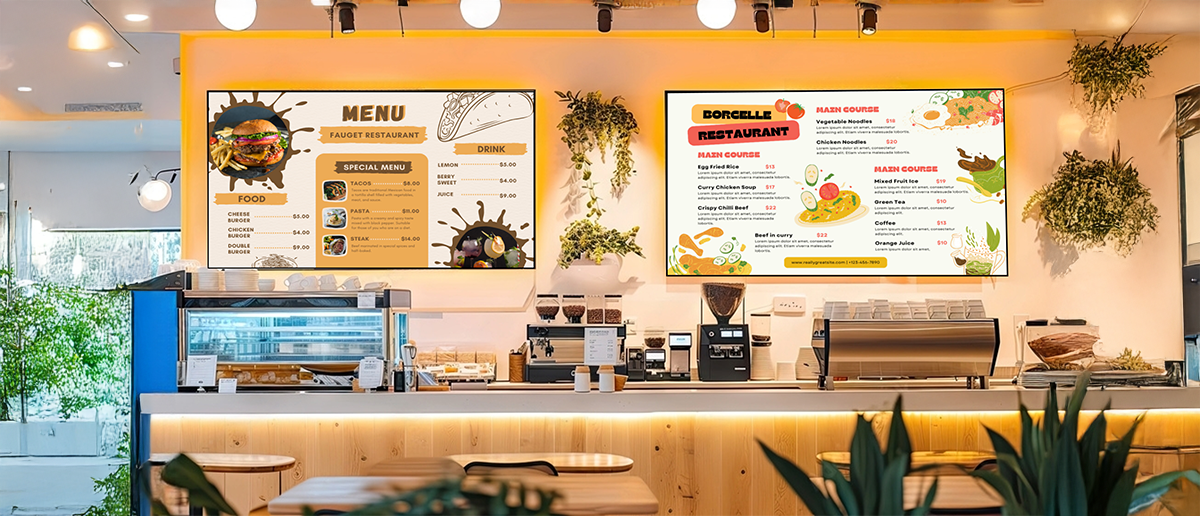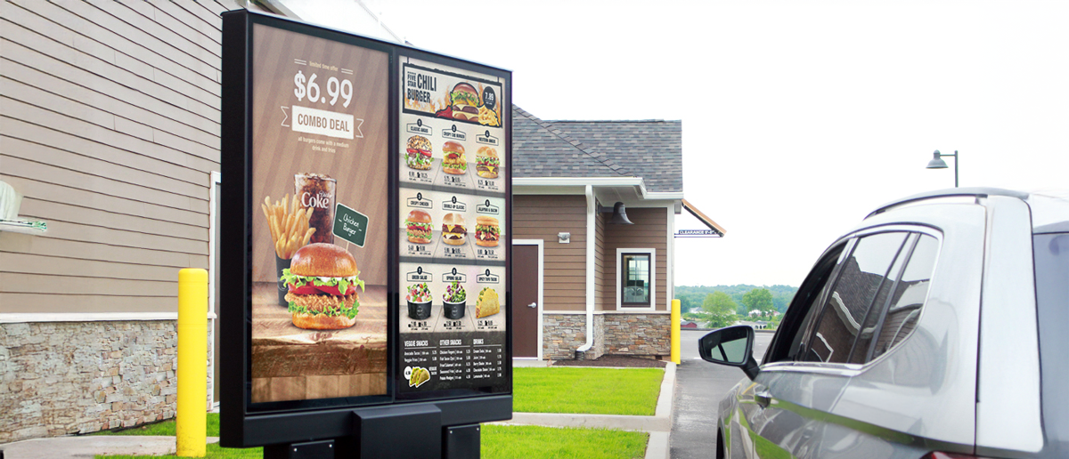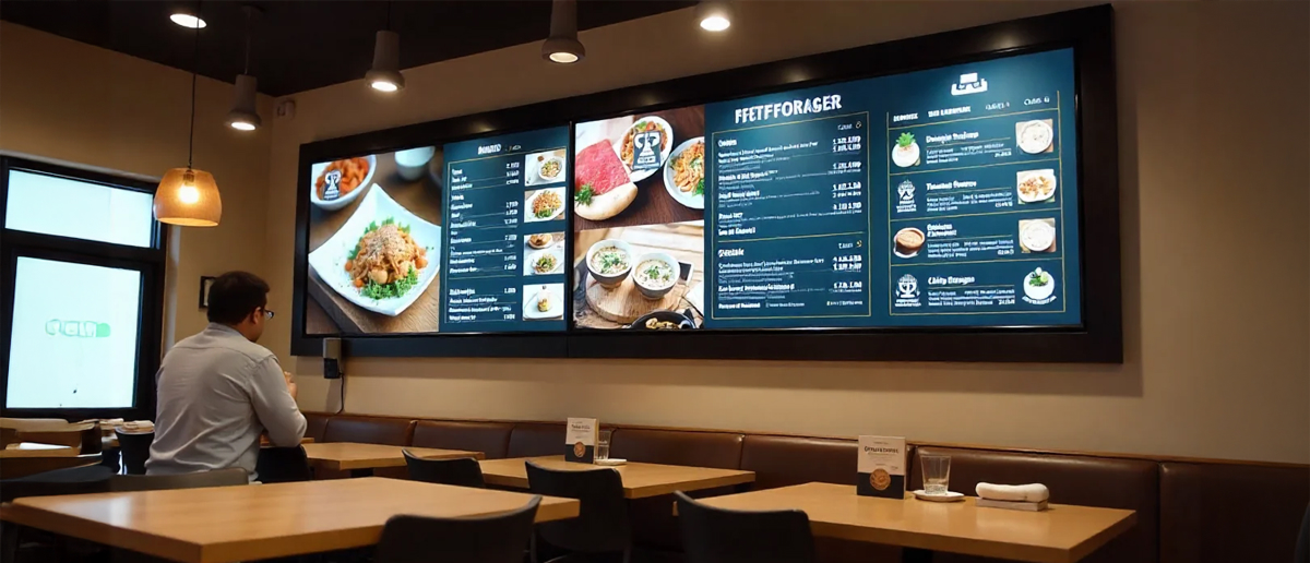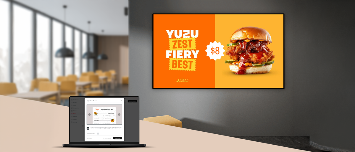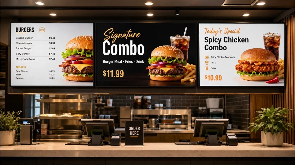
A restaurant can have the right items at the right prices and still lose sales at the point of order. Customers standing in front of a cluttered, hard-to-read board take longer to decide, fall back on familiar orders, and miss the high-margin specials you want them to see.
Digital menu board design is not about making a screen look attractive. It is about structuring information so that customers find what they want quickly, notice what you want them to notice, and place an order without hesitation. The same principles that make any visual communication effective (hierarchy, contrast, spacing, and cognitive load management) apply directly to restaurant menu boards.
This guide covers the core design decisions that separate boards that sell from boards that just display a list. For context on getting started, the digital menu board cost and budgeting guide covers hardware options and pricing structures.
The 6 Core Principles of Digital Menu Board Design
Effective digital menu board design rests on six principles: visual hierarchy to direct the eye, readability at counter distance, adequate whitespace to reduce visual noise, colour contrast that meets accessibility standards, restrained use of photography, and motion that guides rather than distracts. Each principle addresses a specific reason customers hesitate at the point of order.
1. Visual Hierarchy
Position your best-selling and highest-margin items where the eye arrives first: top-centre and top-left. These positions capture attention before a customer starts scanning. Use font size, weight, and colour to signal importance beyond position alone. Items that look the same as everything else get treated as equal choices.
2. Readability
Text must be legible at the distance customers actually read from. A practical check: if a customer has to step closer to read an item description, the font is too small. Sans-serif typefaces render more cleanly on digital screens than serif fonts, particularly at the sizes used for prices and short descriptions. Always proof a layout on the physical screen before publishing; what reads clearly in a design tool can fall short at full scale.
3. Whitespace
Empty space is not wasted space. Clear margins around category sections and padding between items help customers scan the board faster. The instinct when a board looks “light” is to add more content; the right instinct is to check whether what is already there reads clearly.
4. Colour and Contrast
Colour separates zones and communicates brand identity. Every text element should have a contrast ratio of at least 4.5:1 against its background, as required by WCAG 2.1 Level AA (W3C, 2018). This applies to menu boards as much as to websites, and benefits customers across the full range of vision abilities and lighting conditions.
5. Images
A single high-quality food image per board section is more effective than four competing photos at mixed quality. Every image competes for the attention your text needs. Set a limit and apply it consistently across all boards.
6. Motion
Animation draws the eye, which makes it valuable and risky in equal measure. A rotation on a featured promo or a subtle highlight on a high-margin add-on can improve visibility. Animation on background items or sections customers are actively reading fragments focus and slows ordering. Use motion with deliberate intent.
Layout Zones: Where to Put What
Divide a digital menu board into three zones: a spotlight zone at the top for your highest-priority items, category zones across the main body for structured browsing, and a promotional zone for limited-time offers. Where an item appears on the board has as much influence on what gets ordered as the item description itself.
A zone-based layout treats a menu board as a map, not a list. Three zones cover most restaurant configurations:
Spotlight zone (top centre): Your prime real estate. Use it for your best-selling item, a featured combo, or a high-margin product. This is where a customer’s gaze arrives first.
Category zones (main body): Group items by category with clear visual separation between sections. Customers browse within categories. An undivided flat list requires more effort to read and slows ordering.
Promotional zone (bottom strip or side column): Limited-time offers, daypart specials, and seasonal items sit here. The zone is visible but not dominant, so it does not compete with the core menu during the decision process.
Customer example: Third Wave Coffee, a Pickcel customer, uses defined zones across its in-store digital boards to separate core menu items from rotating seasonal drinks, keeping ordering flow clear during high-traffic periods.
Typography Rules for Menu Boards
Use a maximum of two font families on a digital menu board: one for headings and category names, one for item descriptions and prices. Choose sans-serif typefaces for body text. Heading and body text should be visually distinct in both size and weight to give customers a clear reading hierarchy across the board.
Two rules to enforce on any menu board typography system:
Font families: Maximum two. One for headings and category names, one for body copy, item descriptions, and prices. More than two creates inconsistency without adding hierarchy.
Weight contrast: Headings and body text should differ visibly in weight, not just size. A thin body weight under a thin heading produces a flat board with no navigational structure.
One additional rule: avoid all-caps text for item descriptions and names. All-caps slows reading speed in multi-word content and removes the natural word-shape contrast that aids rapid scanning.
Colour and Contrast
Use brand colours to define category zones and apply them consistently across all locations. Every text element must achieve a minimum 4.5:1 contrast ratio against its background per WCAG 2.1 Level AA guidelines (W3C, 2018) to remain legible across the range of customers, lighting conditions, and display brightness settings in a restaurant environment.
Colour coding accelerates navigation. Assigning a distinct background or left-border accent to each category lets customers locate their section before reading every label. The same colour system applied across locations reinforces recognition when customers visit different outlets.
For larger chains, contrast compliance is a practical and reputational consideration. A board that fails WCAG AA contrast ratios excludes customers with lower contrast sensitivity, older guests, and anyone reading in high ambient light. Most digital signage platforms, including Pickcel, support custom colour inputs that can be validated against contrast standards before publishing.
How Many Items Should Be on a Digital Menu Board?
Research on working memory shows that people comfortably process around seven items (plus or minus two) at one time (Miller, G.A., Psychological Review, Vol. 63, 1956). For restaurant menu boards, each category section should contain five to seven items. More than that increases decision time and pushes customers toward familiar safe orders rather than high-margin specials.
Category grouping manages complexity. A board with 40 items divided into six clear categories of five to seven items each is readable. The same 40 items in an undivided layout creates hesitation at the counter.
When a menu genuinely contains more items than a single board can hold without crowding, options include:
- Multiple displays, each covering one or two categories
- Daypart rotation, where separate breakfast, lunch, and dinner layouts replace each other rather than co-existing on a single board
- Carousel rotation for extended menus, with each rotation showing a focused subset of the full range
Customer example: McDonald’s India, a Pickcel customer, uses daypart scheduling across its in-store boards to display focused layouts at each service period rather than presenting the full menu simultaneously.
Updating Your Design: Static vs. Dynamic Content
A digital menu board’s operational advantage over printed menus is the ability to update content from a central dashboard without reprinting or on-site changes. Effective board management means planning update cycles for prices, daypart layouts, seasonal designs, and limited-time offers rather than treating the initial design as fixed.
Several operational events call for a board update:
Dayparting: Breakfast, lunch, and dinner layouts should switch automatically at defined times. Pre-schedule each period through your CMS and the transition requires no manual intervention across any location. For a structured approach to planning each service period’s layout from the start, see the guide to restaurant menu dayparts .
Limited-time offers: Design the LTO version of the board before the offer launches. This puts it live on day one with proper placement in the promotional zone, rather than as a last-minute addition that disrupts layout.
Price changes: With digital signage software in place, a price update takes minutes and pushes to every connected screen in the network. Printed boards require a production cycle for every change.
Seasonal redesigns: Updating hero imagery, colour accents, and the promotional zone on a quarterly basis keeps boards current without requiring a full rebuild.
Digital Menu Board vs. Printed Menu
| Feature | Digital Menu Board | Printed Menu Board |
|---|---|---|
| Content update speed | Minutes from central dashboard | Production cycle + physical replacement |
| Cost per content change | No incremental cost | Design + print + delivery cost per change |
| Multi-location sync | Simultaneous push to all screens | Each location requires separate physical update |
| Daypart switching | Automatic scheduling, no manual action | Manual board swap at each location |
| Sold-out items | Immediate removal from live board | Reprint required or manual notation |
| Seasonal redesign | Update imagery + accents + promo zone; no full rebuild | Complete redesign + print production |
| Operational dependency | No on-site action required | Staff or contractor visit per location |
Pickcel for Menu Board Design
Pickcel is the digital signage platform trusted by 9,000+ businesses across 150,000+ screens in 70+ countries, including leading QSR and specialty coffee brands across India. The platform holds SOC 2 Type II and ISO 27001 certifications.
For restaurant operators, Pickcel’s digital menu board software includes a library of menu board templates built around the layout, typography, and contrast principles in this guide. Operators edit content, update pricing, and schedule daypart switches without modifying the underlying design structure. Browse the digital menu board template library to see available formats.
Arogya Ahaara uses Pickcel to manage menus across multiple locations from a single dashboard, with changes propagating to all screens at once. For a broader view of what restaurant operators need from a signage platform, see restaurant digital signage software .